| Author |
 Topic Topic  |
|
MguyX 
"X marks the spot"
|
 Posted - 06/07/2007 : 09:25:52 Posted - 06/07/2007 : 09:25:52


|
The logo unveiled yesterday is -- without question -- the most hideous Olympics logo ever (here's a spot to look at some of the earlier ones). 
It looks like an 80's New Wave swastika, as perceived in a pool of vomit.
My condolences to all our fine British fwiffers and the rest of the U.K., who will universally be blamed for that monstrosity, though they had nothing to do with its conception. My heart goes out to you.  |
|
|

BaftaBaby 
"Always entranced by cinema."
|
Posted - 06/07/2007 : 10:23:59
|
quote:
Originally posted by MguyX
The logo unveiled yesterday is -- without question -- the most hideous Olympics logo ever (here's a spot to look at some of the earlier ones).
It looks like an 80's New Wave swastika, as perceived in a pool of vomit.
My condolences to all our fine British fwiffers and the rest of the U.K., who will universally be blamed for that monstrosity, though they had nothing to do with its conception. My heart goes out to you.
Yeah, it's been the subject of many a radio phone-in show over the past few days. Apparently, too, in its animated form it's triggered epileptic fits.
Now what could say more for international sporting fraternity than that!  
|
 |
|
|
Sal[Au]pian
"Four ever European"
|
Posted - 06/07/2007 : 10:52:27
|
I cannot tell you how angry I am about it. I loved the Thames logo and did not realise they were not keeping it. Their whole thinking is completely misplaced - with cringeworthy notions of connecting wiv da kidz etc and thinking that the Olympic colours (representing every country's flag) are cliched. On top of that, causing epilepsy in children is not exactly ideal.
I was in the first 1% or so to sign this petition, but unfortunately it looks like the originator does not want to press ahead with it.
I love the Olympics and as a London resident did not care about how much extra tax I had to pay for them. This has completely deflated my excitement. I'm dreading the time coming and this logo being everywhere. |
Edited by - Sal[Au]pian on 06/07/2007 10:56:18 |
|
|
|

Beanmimo 
"August review site"
|
Posted - 06/07/2007 : 11:13:52
|
quote:
Originally posted by SalopianOn top of that, causing epilepsy in children is not exactly ideal.
I agree with what you are saying in the rest of the above statement but just to be clear as MguyX said a part of the moving image
"Triggered epileptic fits in sufferers, adults and children alike"
it doesn't actually
"cause epliepsy"
|
|
|
|
Sal[Au]pian
"Four ever European"
|
Posted - 06/07/2007 : 11:20:06
|
quote:
Originally posted by Beanmimo
quote:
Originally posted by SalopianOn top of that, causing epilepsy in children is not exactly ideal.
I agree with what you are saying in the rest of the above statement but just to be clear as MguyX said a part of the moving image
"Triggered epileptic fits in sufferers, adults and children alike"
it doesn't actually
"cause epliepsy"
I actually chose my wording intentionally. At first, I thought it was just causing fits in previous epileptics, but I have since heard that this may have been the first fit for some people. While their epilepsy would probably have been triggered later, it may not have been. Also, I chose "causing epilepsy" to ambiguously cover "causing the condition of epilepsy" and "causing an instance of epilepsy", in order to be on the safe side. |
|
|
|

Sean 
"Necrosphenisciform anthropophagist."
|
Posted - 06/07/2007 : 12:06:21
|
I don't think the logo had anything to do with epileptic fits. How could it? If it did, then the colour pink would cause fits anywhere.
http://www.abc.net.au/news/newsitems/200706/s1943486.htm
Extract below...
The video clip shows a diver plunging into a pool as part of a campaign to promote the jagged Olympic logo, a graffiti-like blow-up of the number 2012 in a range of colours including hot pink and electric blue.
A London 2012 spokeswoman said the concerns surrounded a four-second piece of animation shown at the logo's launch on Monday and recorded by broadcasters.
She emphasised that it was not the logo itself which was the focus of health worries.
"This concerns a short piece of animation which we used as part of the logo launch event and not the actual logo," she said.
"It was a diver diving into a pool which had multi-colour ripple effects."
But the logo itself is hideous. It looks like something that would be appropriate for a Neo-Nazi Mardi Gras....  |
Edited by - Sean on 06/07/2007 12:07:31 |
|
|
|
Sal[Au]pian
"Four ever European"
|
Posted - 06/07/2007 : 12:18:53
|
| Yes, I was treating the logo and the brand as synonymous, but that's reasonable to do as they have made a big point of presenting it like that. |
|
|
|

ChocolateLady
"500 Chocolate Delights"
|
Posted - 06/07/2007 : 12:27:00
|
quote:
Originally posted by Se�n
But the logo itself is hideous. It looks like something that would be appropriate for a Neo-Nazi Mardi Gras....
Neo-Nazi Mardi Gras? Sounds like a great idea for a Saturday Night Live sketch!
(But inappropriate as a Logo for the Olympics.)
|
Edited by - ChocolateLady on 06/07/2007 12:27:40 |
|
|
|
Whippersnapper. 
"A fourword thinking guy."
|
Posted - 06/07/2007 : 15:06:18
|
OK, come on now guys, what do you expect for a mere �450,000 ($800,000)?
|
|
|
|

Ali
"Those aren't pillows."
|
|
|

duh 
"catpurrs"
|
Posted - 06/07/2007 : 15:50:52
|
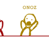
quote:
Originally posted by Ali
A subtle reworking.
'SHIT???' Oddly enough, I find that rendition to be far more pleasing than the actual one. |
|
|
|

Chris C
"Four words, never backwards."
|
Posted - 06/07/2007 : 17:48:55
|
I was told that if you look at the original version and squint a bit, it looks like Lisa Simpson going down on somebody.  |
|
|
|
turrell
"Ohhhh Ohhhh Ohhhh Ohhhh "
|
Posted - 06/07/2007 : 18:14:18
|
| Why pink and white? What's wrong with the rings of colors that represented unity among the world's nations and races? This is plain crap. |
|
|
|
MguyX
"X marks the spot"
|
Posted - 06/07/2007 : 21:38:31
|
In fact, I thought it was mandatory to use the colored rings.
Guess I was mistaken.
Love the subtle reworking, Ali. |
|
|
|

GHcool
"Forever a curious character."
|
Posted - 06/08/2007 : 05:47:58
|
| When I lose a game of Tetris, the result usually looks kind of like that logo. |
|
|
|

TitanPa
"Here four more"
|
Posted - 06/08/2007 : 20:34:53
|
At least it doesnt look like the Montreal Canada XXI Logo. It looks as though they were giving the world the middle finger.
Cant wait to see what the London Mascot will look like. |
Edited by - TitanPa on 06/08/2007 20:36:21 |
|
|
|
Topic |
|
